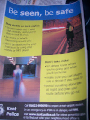
I emailed Mark Ginsberg, and asked him to send us some police posters for our shots at the station, and he sent me 'Be seen, be Safe' which i thought was really good as it is contrapuntal to how our protagonist wants to be.
 The information provided is in bullet points, so its easy to read and gets straight to the point they are trying to convey. It also has two large pictures so that it is more appealing from a distance and it has bright colours or high visibility colours so that it can also be seen from a distance which is parallel to what they are stating you should do when you go out at night.
At the bottom of the poster they have put on the contact details, for emergency's, non-emergency's and their website address.
The font is simple, so it is easily read, and the colour of the font depends on the back round colour, but it is white or black which could be said to be symbolic as it is the same as their uniforms.
No comments:
Post a Comment